# Windows 11 Start Menu: A WinUI 3 Rebuild for Speed and Control
Canonical: https://snipgeek.com/blog/windows-11-start-menu-winui3-redesign
Locale: en
Description: Microsoft is rebuilding the Windows 11 Start menu on WinUI 3, adding resizable layouts, section toggles, and much faster response under heavy load.
Date: 2026-04-21
Updated: 2026-04-21
Category: Windows
Tags: windows, windows-11, ui-design, start-menu
JSON: https://snipgeek.com/api/posts/windows-11-start-menu-winui3-redesign?locale=en
---
I've been making uneasy peace with the Windows 11 Start menu for a while now. On my main laptop it takes that awkward extra beat to appear whenever the CPU is busy, and if I try to type a search too early, the first key or two just vanishes into the ether. So when I saw the leaks about Microsoft rebuilding the whole thing on WinUI 3, my first reaction wasn't hype. It was a very quiet "finally."
Here's the short version for anyone skimming: Microsoft is rebuilding the Windows 11 Start menu from the ground up on the WinUI 3 framework. The goal is a Start menu that stays responsive even when the system is under heavy load, lets you pick between a small or large layout, and lets you toggle entire sections off if you never use them. Same familiar shape, finally shaped to how each person actually works.
## A WinUI 3 Rebuild, Not Just a Reskin
The big shift under the hood is that Start is being rewritten on **WinUI 3**, the same modern framework Microsoft has been slowly migrating Windows onto. According to Zac Bowden at Windows Central, this is part of a broader project internally codenamed **Windows K2**, focused on making Windows 11 a fast, fluid, and stable platform again rather than a parade of new icons.
That framework choice matters because the current Start menu still carries baggage from older UI layers. When the system gets loaded up, those layers feel it. The rebuild is meant to remove that drag and put Start on the same responsive foundation as the rest of the shell being refreshed through [Microsoft's broader Windows 11 quality push in 2026](/blog/windows-11-quality-2026-update).
## Resize It, or Hide the Parts You Ignore
Right now Windows 11 decides for you whether you get the small or large Start layout, and it makes that call from your screen size alone. The new version finally hands that decision back. In Settings you'll be able to pick **small** or **large** manually, regardless of what Windows thinks your display deserves.
The bigger win for me is the section toggles. If you never use the Recommended feed, you'll be able to switch it off with a single click. Same for Pinned, grouped categories, and even the full All Apps list. Start becomes modular, more like a panel you configure than a fixed layout you tolerate.
These details come from leaks and an ongoing Insider rollout. Specific toggles and their exact location in Settings may still move around before they reach the stable channel.
## Faster, Even When the PC Is Choking
Performance is the quietest part of the announcement and probably the most useful. The new Start menu is designed to stay responsive even when CPU usage is pinned, which is exactly when the current one tends to freeze. The search box inside Start gets the same treatment — you should be able to hit the Start key and start typing immediately without losing the first letters.
That one fix alone will matter more than any visual change. Most people don't look at Start; they reach for it. A menu that reliably opens and listens when your system is busy is, honestly, the feature I've wanted the most.
## The Design Roads Microsoft Didn't Take
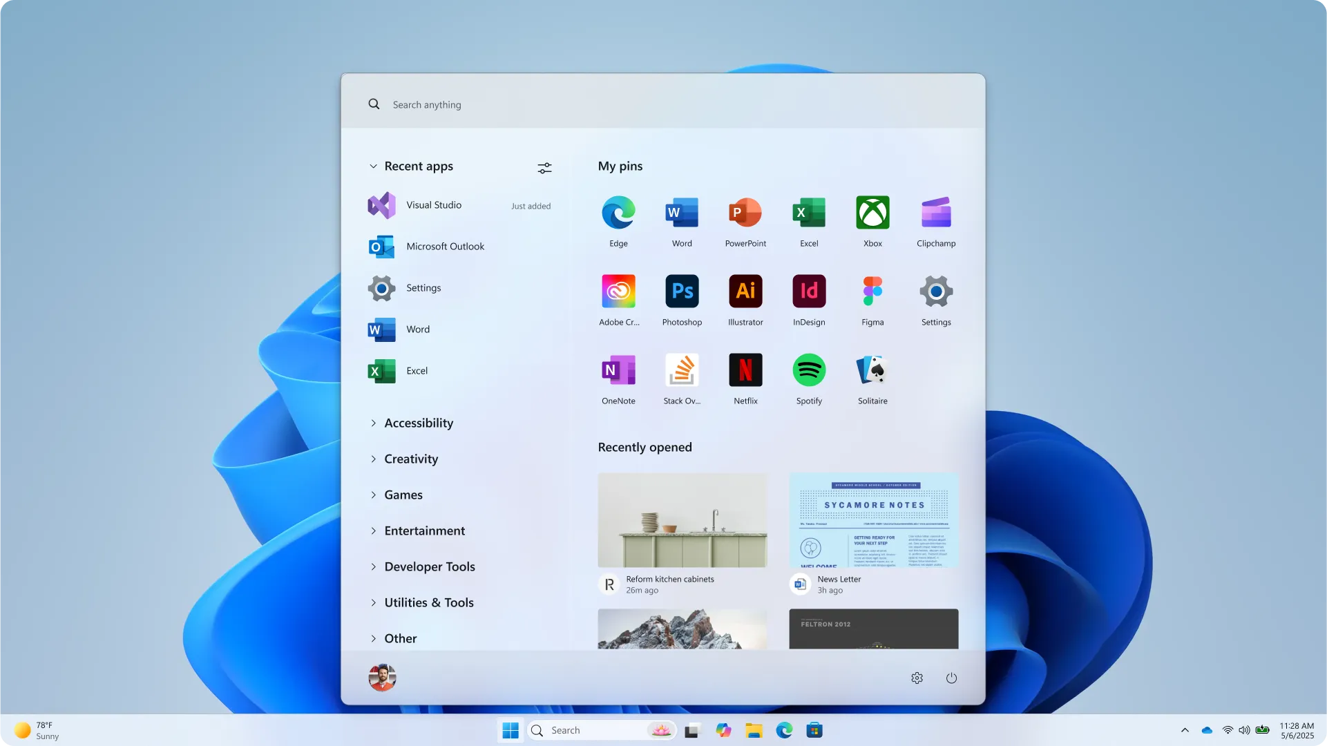
What I didn't expect was how much of the process Microsoft ended up sharing publicly. In a recent post on their design blog, the team walked through how Start was re-explored for 2026 — whiteboards, floor-to-ceiling paper prototypes, unmoderated studies with over 300 Windows 11 users, and live co-creation calls.
A lot of those early directions never shipped. The images below are some of the exploration concepts Microsoft tried along the way before landing on the final Start menu you see in the hero of this post.
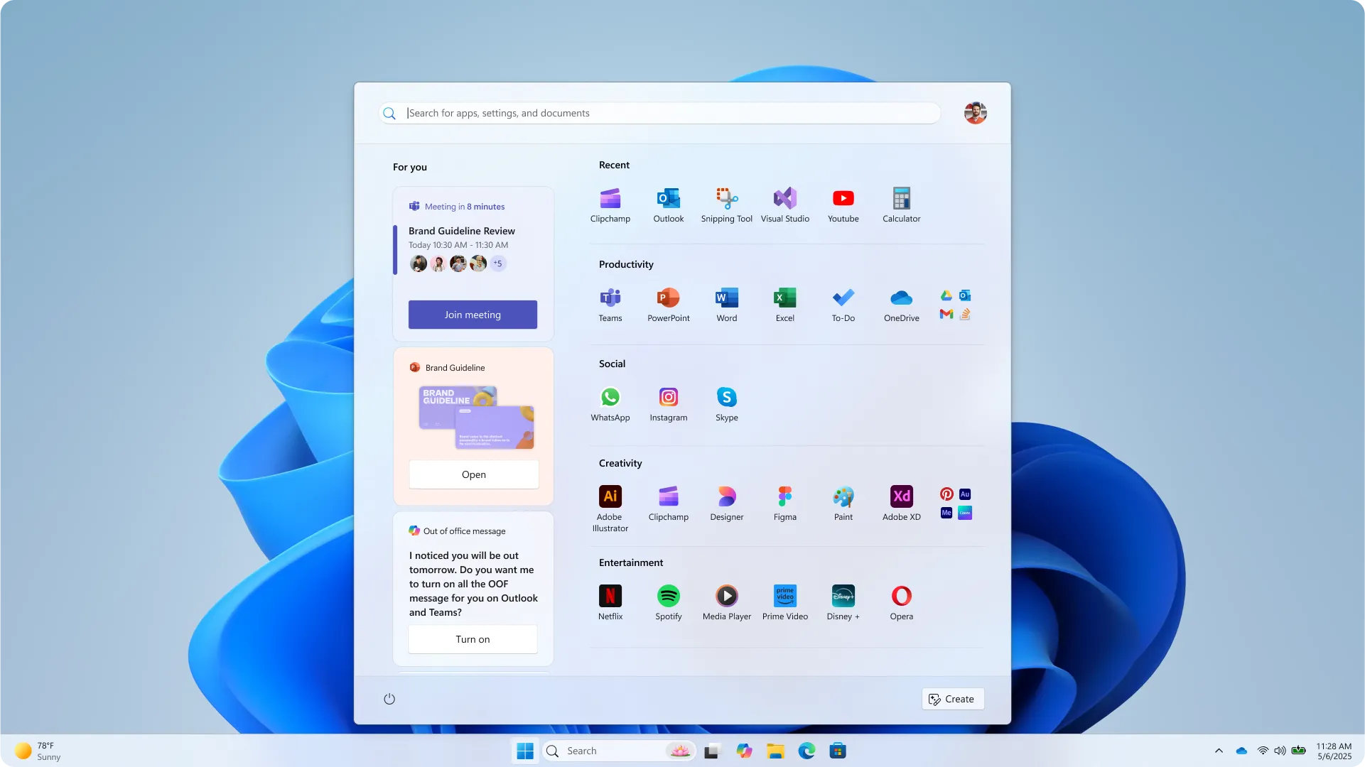
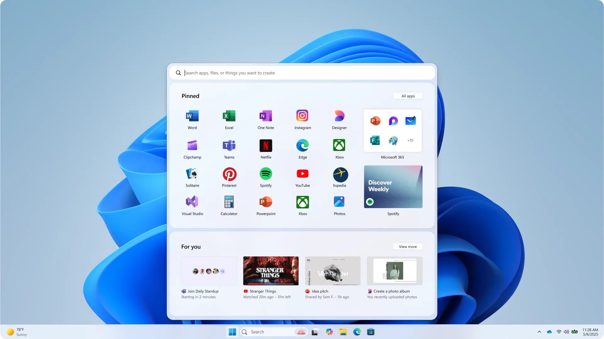
Seeing these side by side with the final design was surprisingly reassuring. Some of the explorations were honestly quite bold — large media tiles, heavier phone integration, radically reshuffled app views. The final result looks more conservative, and I think that's the right call. Start is a muscle memory object for most of us.
## Four Principles That Stayed
The design team boiled the whole effort down to four guiding ideas, and they're worth reading because they explain why the final menu doesn't look radically different even after a full rewrite:
- **Apps, at a glance** — pinned, installed, and freshly discovered apps should be right there, no digging.
- **Make it yours** — Start should feel like it grew up on your desk, not someone else's.
- **Accelerate the day** — every pixel earns its keep so routine actions get faster.
- **Honor the icon** — respect three decades of muscle memory. Update, don't upend.
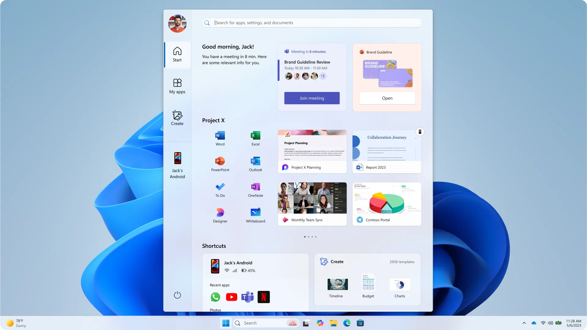
Two more exploration directions that leaned harder into "upend" rather than "update" — you can see why they got parked in favor of the final design.
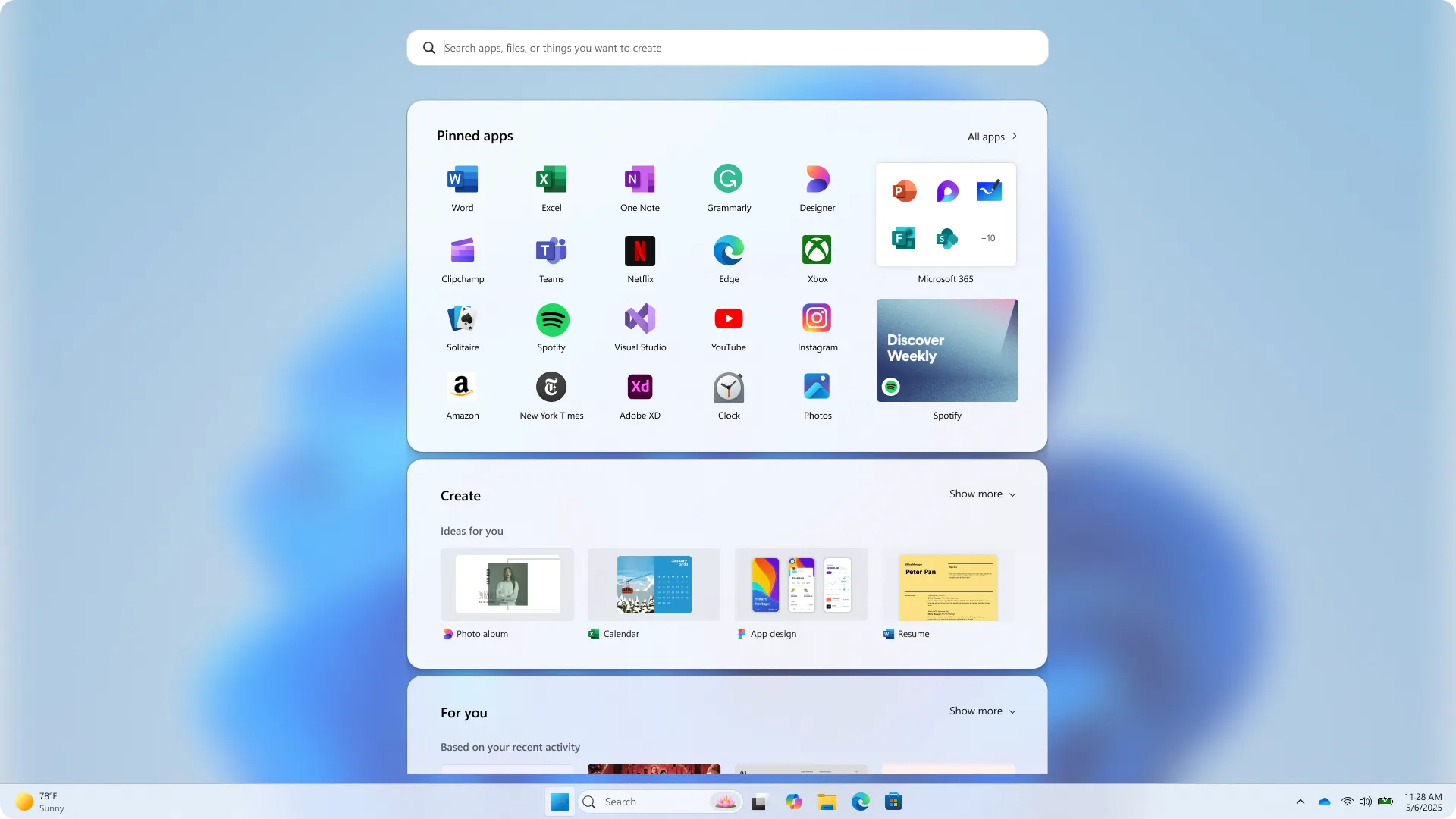
The final experience keeps the same entry point and the same silhouette, but adds dynamic recommendations, better All Apps views (categories, grid, or A-Z), gently blended phone content, and personalization that actually respects your screen real estate.
## SnipGeek's Take: A Rebuild Aimed at the Right Pain
I've heard big Start menu promises before, and most of them were cosmetic. This one feels different because it's tied to a framework migration, a performance target, and a customization model — three things that are genuinely hard to fake once they ship.
What sells it for me is the toggle story. If Microsoft honestly lets you disable the Recommended feed, disable pinned apps, and pick your layout, then the criticism that Start has been too prescriptive since day one finally gets a real answer. And if you're the kind of person who sets up a new machine carefully, it pairs well with things like [choosing a clean device name after install](/blog/rename-pc-windows-11) and going through [the first things to do after installing Windows 11](/blog/to-do-after-install-windows11) — because your Start will finally match the way you actually use that PC.
There's no firm release date yet. Expect this to land first in Windows Insider builds and then fold into the broader 2026 quality rollout.
Which part of this are you most looking forward to — the toggles, the resizable layout, or just a Start menu that stops eating your keystrokes? Drop a comment, I'd genuinely like to hear which pain point hit you the hardest.
### References
1. [Microsoft plans major Start menu upgrades for Windows 11 — Windows Central](https://www.windowscentral.com/microsoft/windows-11/microsoft-plans-major-start-menu-upgrades-for-windows-11-with-better-customization-and-performance-users-will-soon-be-able-to-resize-and-toggle-off-entire-areas-of-start)
2. [Start, fresh — Redesigning the Windows Start menu for you — Microsoft Design](https://microsoft.design/articles/start-fresh-redesigning-windows-start-menu/)
3. [Hot: Microsoft Siapkan Perombakan Ulang Start Menu Windows 11 — WinPoin](https://winpoin.com/hot-microsoft-siapkan-perombakan-ulang-start-menu-windows-11/)