Telegram's 'Liquid Glass' UI Redesign on Android
Iwan Efendi4 min
Telegram for Android rolls out its biggest UI overhaul with the "Liquid Glass" approach, ditching the side menu for a more modern bottom navigation.
Baca dalam IDID
In early February 2026, Telegram for Android released the biggest interface update since the app's inception on the platform. Version 12.4.x brought a complete overhaul of the navigation structure, visual aesthetics, and several user experience (UX) elements.
This redesign adopts a visual approach called “Liquid Glass,” moving away from the classic side-menu structure to a more modern, transparent, and one-handed-use-oriented layout. This approach was previously introduced on iOS and is now more consistently implemented on Android.
Here are the most prominent key changes in this update.
 Four main tabs are now permanently placed at the bottom of the screen:
 Key characteristics of this design:
 Some features that were previously in the side menu have been moved to the overflow menu (three-dot icon) in the top right. This structure simplifies navigation while maintaining a clean main interface.
This update sparked widespread discussion in the user community.
Most were positive:
The redesign of Telegram for Android in February 2026 is one of the most significant transformations in the app's history on the platform.
With:
If your interface looks different from the screenshots above, run this quick checklist:
Not all devices receive visual changes at the exact same time. Telegram can roll out UI updates gradually based on app build and server-side toggles.
Common user reports and what they usually mean:
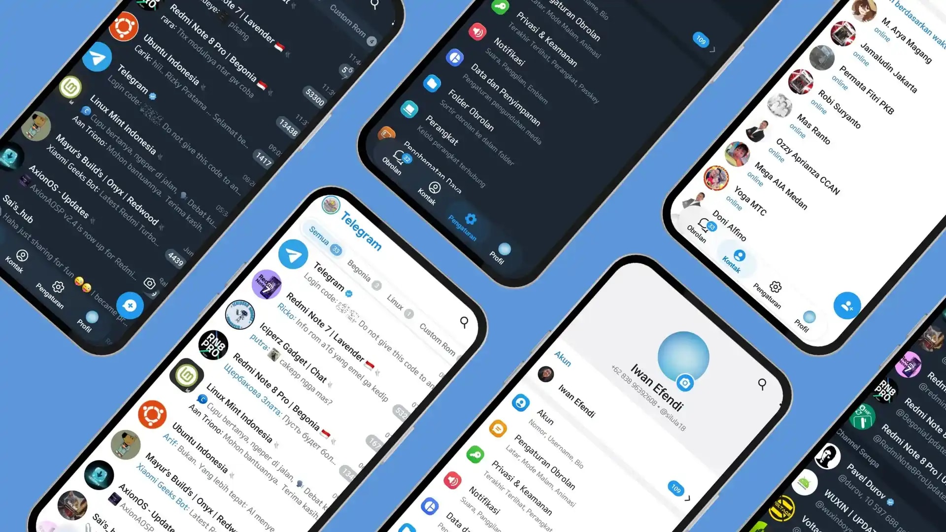
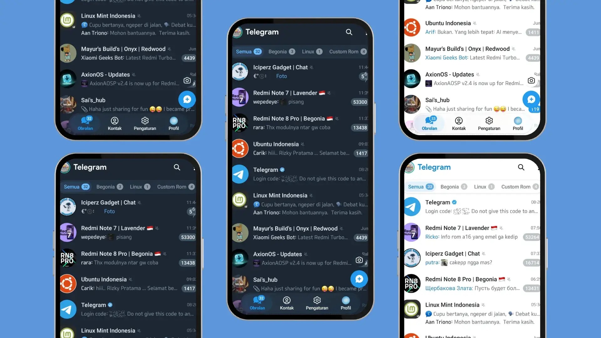
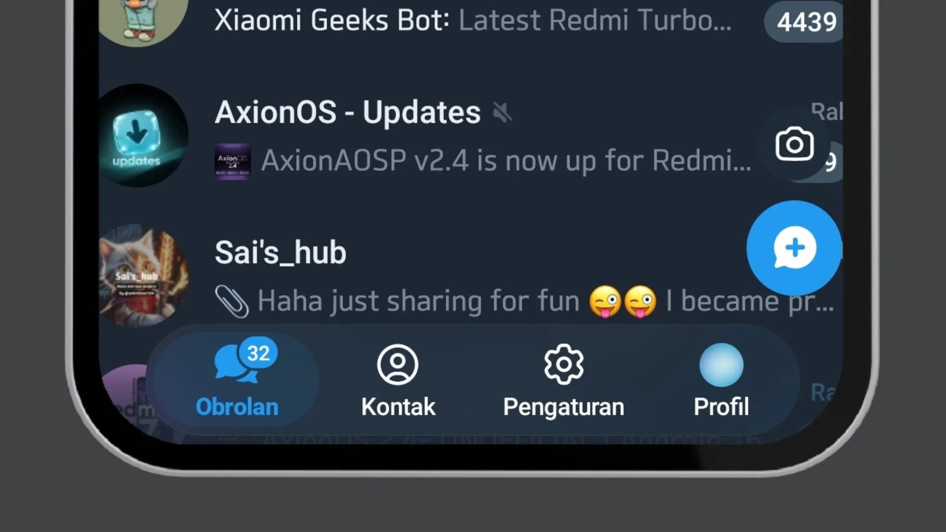
1. Main Visual Changes
a. Bottom Navigation Bar
The most fundamental change is the move of the main navigation from a hamburger menu to a bottom navigation bar. This pattern is more aligned with modern Android app design standards.Zoom
- Chats
- Contacts
- Settings
- Profile
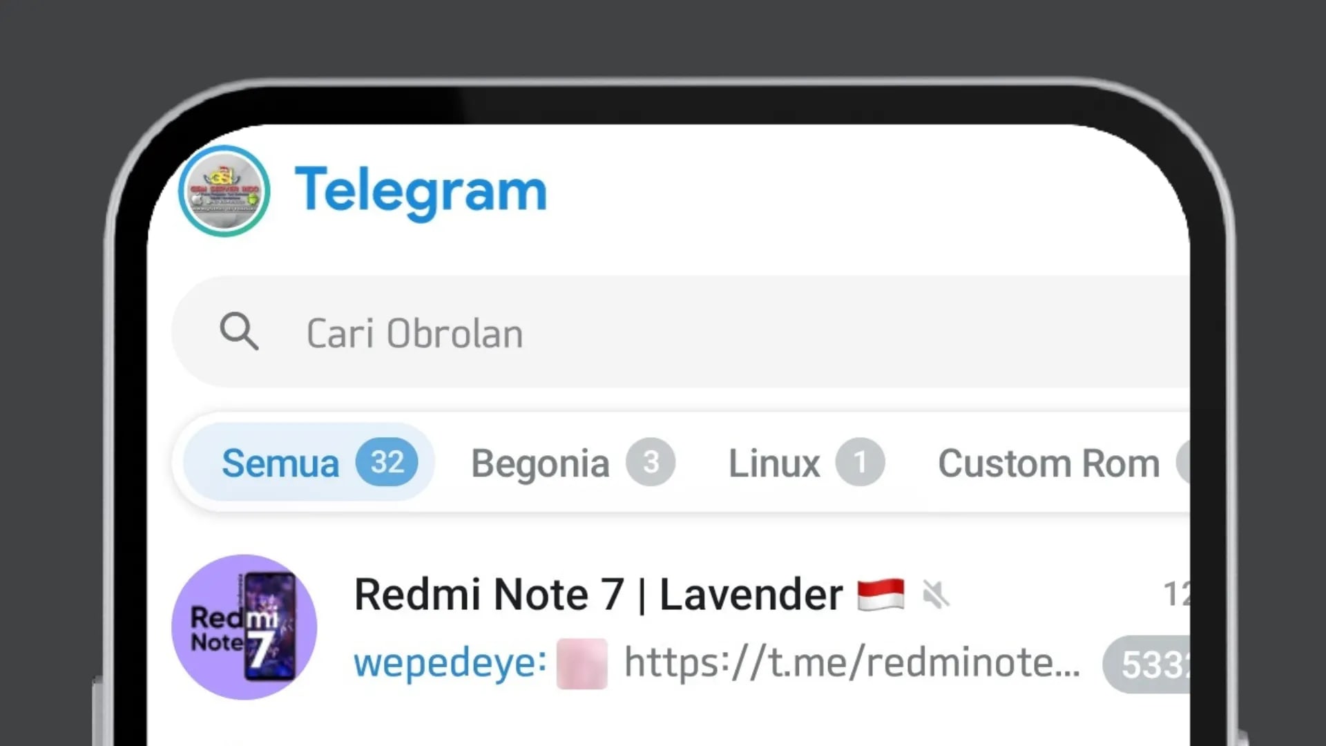
b. “Liquid Glass” Design
Telegram adopts semi-transparent elements that provide a layered and more dynamic visual effect. This approach brings a modern feel, especially in light mode.Zoom
- Panels with a light blur/transparency effect
- More rounded element corners
- A smoother visual hierarchy
- A lighter and more spacious look
c. Improved Access to Search & Features
The search bar is now larger and permanently displayed at the top of the chat list, no longer hidden within a small icon.Zoom
2. User Experience (UX) Improvements
a. Cross-Platform Consistency
This redesign aligns the user experience between Android and iOS. The navigation structure, visual style, and interactions now feel more consistent across both platforms.b. Performance and Responsiveness
According to the official release notes, the interface code was rebuilt from scratch. The results:- Smoother transitions
- Faster navigation response
- Better stability across various Android devices
3. Additional Features in Version 12.4.x
a. More Adaptive Group Management
The update also touches on community management aspects:- If a group owner leaves, ownership can be automatically transferred to another admin after a certain period.
- Group owners can appoint a successor admin before leaving the group.
b. Gift Crafting & Colored Bot Buttons
Telegram introduces new interactive features: Gift Crafting Users can combine multiple digital gifts to create rarer or more exclusive items. Colored Bot Buttons and Emojis Bot developers can now customize buttons with colors and emojis, creating a more visual and intuitive experience for users. This feature expands interaction flexibility, especially in the bot ecosystem and digital monetization.4. Community Response
- More ergonomic bottom navigation
- A more modern look
- More comfortable one-handed use
5. Conclusion
- More ergonomic bottom navigation
- The “Liquid Glass” visual approach
- Performance improvements
- New management and interaction features
6. Quick Checklist After Updating
- Check that your app is on Telegram 12.4.x or newer.
- Force close Telegram once, then reopen it.
- Go to Settings > Chat Settings and confirm your current theme (light/dark) to see how transparency behaves.
- If animations feel choppy, restart your phone after the update so background caches are rebuilt.
7. Known Issues and Practical Notes
- Bottom tabs missing: your build may still be on an older UI layer, even if the app was recently updated.
- Transparency looks too strong: this is usually more noticeable on bright wallpapers and can be reduced by using a darker chat background.
- Feature location changed: check the top-right overflow menu (three dots), since several side-menu actions moved there.
Topics
Topics in this article
Explore related topics and continue reading similar content.
Share this article
Discussion
Preparing the comments area...